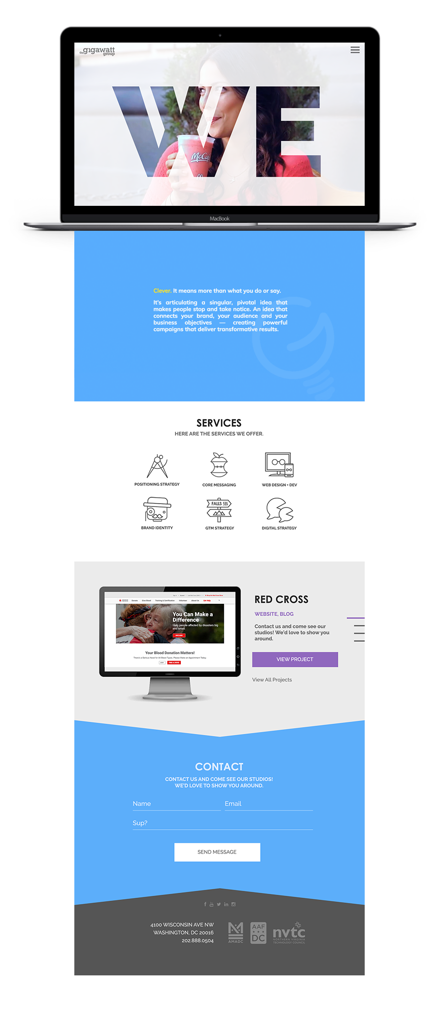
The Gigawatt Group, a boutique agency that offers digital marketing, design, and development services, had a full brand redesign to reestablish themselves as an company. I was brought on as lead to the project to redefine their brand after an administration change. Due to client projects taking precedence over this project, our team worked in monthly sprints to meet goals.
Gigabot, the multifunctional innovative robot which is the mascot of The Gigawatt Group, underwent an upgrade. Combining the imagery of a lightbulb, the logo of Gigawatt, with different facets of the Gigabot ultimately led to a design that was both iconic (one larger eye, one smaller eye) while still paying homage to its original form.
To make the new brand easier to share internally across developers and designers, we created a living style guide.
One component of the style guide we wanted to include was a "Gigabot" section - a section which had not only the updated mascot, but also a fun customize-your-own-Gigabot worksheet which guided a future marketing campaign. We also included links on certain items which allowed users to immediately download or copy sections without having to do the added step of right-clicking and selecting "Save".
I was responsible for creating the libary of icons that we could reuse across our marketing materials to represent the services Gigawatt offered. We wanted to make sure they had a lot of personality to them while still being professional and clever.
Getting to the "core" of what each service meant (for example, the apple core representing "Core Messaging"), was important to highlight both the message and personality of that service and Gigawatt.
To elevate the icons and give them more depth online, we decided to animate them. In order to prep for the animation stage, we created simple animation storyboard frames.
Next, we brought the icons to life with a little Bodymovin magic. This plugin allowed us to export After Effects animations as bodymovin.js files which we could then use on our website.
After we had completed the wireframes, we then moved on to the mockups where we created what the final designs would look like. Considering we had a pitch coming up, we decided to break the launch into two phases: a soft launch and a hard launch, with the soft launch being an abbreviated version of the hard launch. Hard launch is set for later this year.