The Unhappy Reality
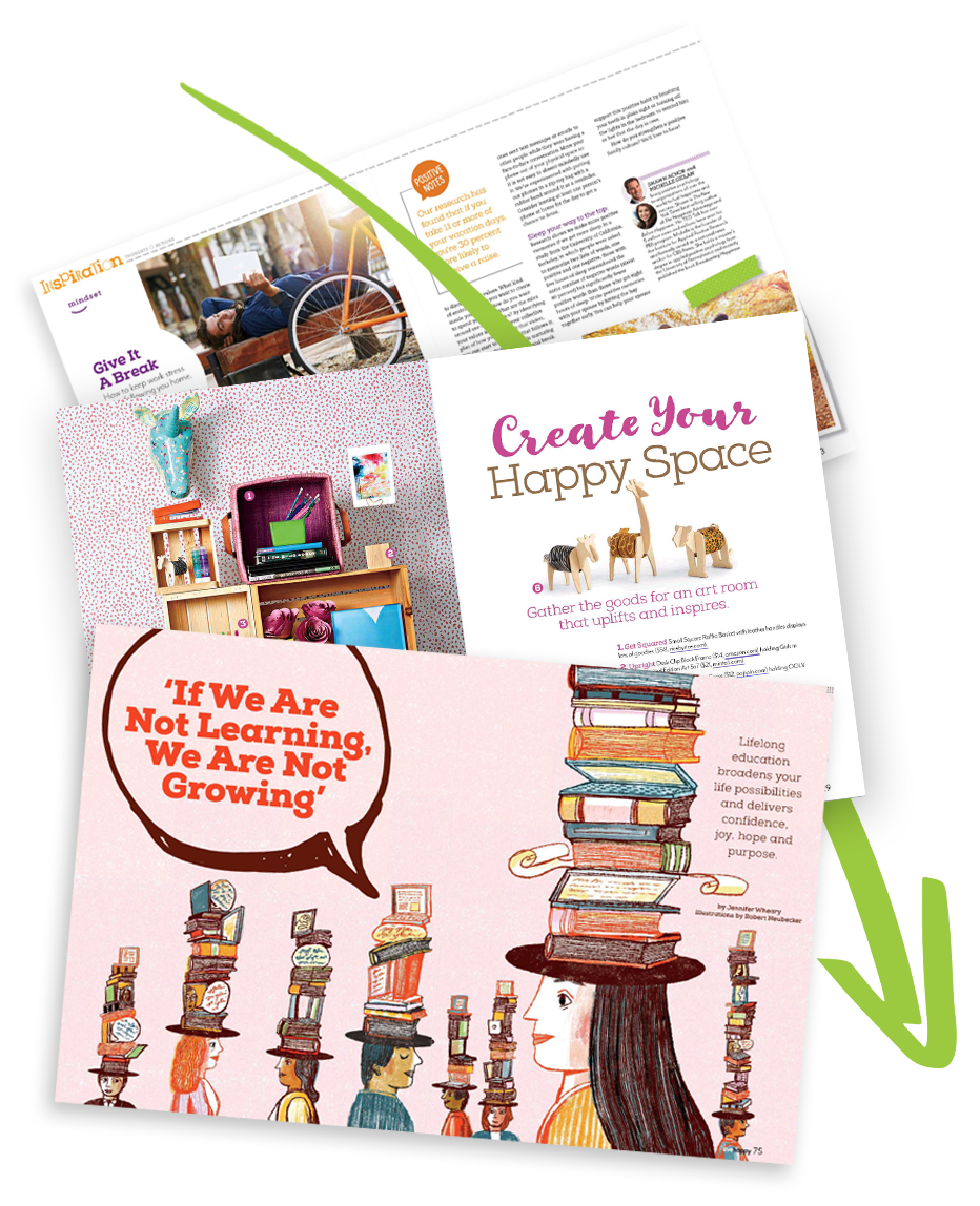
Live Happy Magazine had seen a shift from print to digital over the years. In an effort to compete in the growing digital market, they decided to create a mobile app called "Live Happy: Digital Edition." I was in charge of converting the print magazine into an Product app which was tested/previewed in AEM Preflight.


Challenges Going Digital
- Length of Content
The common magazine spread is 16 3⁄4” x 10 7⁄8” while the average phone height at the time of creation was 4-5.5 inches. Condensing this information into a smaller device without overloading the user with content became a challenge.
- Responsive Sizes
Unlike magazines that are printed at a set size, digital devices range in sizes forcing us to make several interpretations of the magazine from phone to tablet.
- Fonts
The fonts used for print were made for print, not the web. Some print fonts that had a web license were converted to the proper file format while others were converted to a similar-looking Google Font.
- Accessibility
Converting to digital introduced a new level of accessibility, especially when it came to images, color contrast, and sizing. Many of the images needed to be converted to a web-friendly version (alt text, font conversion from image, etc.) while text needed to be adapted to different screen sizes.